Thursday, December 17, 2009

Colored girls


It's always a good idea to preserve continuity with color comps. If you're going to paint in watercolors, you should always do your comps in watercolors. This makes it much easier to match your colors on the finished painting. It's even better to write down color formulas or combinations used to achieve specific colors. The reflective and translucent quality of different mediums can wreck havoc with colors and perception, and this goes double for the computer. You throw in the differences between reflected and projected colors and you're begging for a headache.

So, I did this comp on the computer with a sweet Japanese ink and paint program called SAI Paint Tool. It was fast and so convenient, and it's a great program for tablet PCs. The only real drawback was trying to match colors on the finished piece, and that was a real headache. I wonder why?

The colors needed to be bright but just south of psychedelic. I always thought the 60s made it okay to use bright colors, but when we got to the 80s it had spun out of control. The 70s got it just right, and that was the feeling I wanted. Laura "Colorista” Martin works across the hall from me here at the studio, so I called her in for a second opinion, and after a bit of tweaking you could actually hear the colors sing.

Choose your weapons


Illustrations often key on different aspects of picture making, and I think it's important to recognize those keys as early as possible. It's like setting up a plot line or genre before starting the serious work of writing. In a sense, it's what the painting technique is about.
Your dominant keys are technique, design, color, and storytelling. I want every painting to have some bits of all these elements, but I want to dominate the piece with one or two then downplay the others. If I do a painting about storytelling then I may want to de-emphasize the colors or rendering. This way the storytelling takes center stage and the painting doesn't feel heavy or exhausting to the viewer.

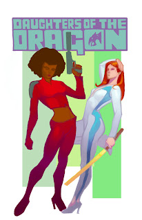
My design here is simple, and there isn't much storytelling beyond the character’s bad ass attitudes, so this is all about color and technique. With a special accent on color.

Here's my color range for this piece. I'm not cheating in extra colors here but I'm more splitting my tertiary colors. So I'm using… septiary colors? Not sure if I'm not making that up, but don't try it at home. All my yellows will lean slightly towards green (lemon yellow) and my oranges will push slightly red.
This color range is my Bible for this painting and I will religiously adhere to it.

Editors note: I consider myself an agnostic leaning towards atheism, so I reserve the right to bail at a moments notice.

Wednesday, December 16, 2009

Daughters


You know what really puts me into the holiday spirit? Yeah that’s right, Daughters of the Dragon.

This image has been knocking around in my head for a while now. I always like to keep several commissions going at once. This is because of the random way ideas form. It’s another thing that separates commercial work from commissions. Commercial work will have exacting requirements for size, theme, and especially time. I always do battle with that last one. Ideas have to be created, edited, and produced on tap. Sometimes this can be like squeezing water from a stone, but it can often lead to spontaneous shotgun creativity. Commercial work is the active pursuit of images, but commissions are passive. I allow the paintings to come to me. Every so often it’s all in a rush or dream, but often it’s like following a trail of breadcrumbs. This was defiantly breadcrumbs. One day I would get the attitude of a pose, and then a week later I’d get a sense of colors, and a month later Misty’s face would pop into my head clear as day.

This sketch was the last piece of the puzzle, and with it I was off to the races.

Monday, August 10, 2009

Elizabeth Dismount


This is after going back in and taking care of that last 20% of work on the face. It’s really about defining edges and checking my value schemes. Most of this work is done by placing the image across the room, or under a heavy squint.

Portraits and likenesses are always a tricky prospect. I find that most failures come from trying too hard to reproduce one's reference. A photo can only portray how something looks, and that is hardly the measure of a person. Looking back, I find that I didn't really understand portraiture until I spent some time doing caricatures. It was a real eye-opener to understand it was possible to capture a person’s “likeness” without accurately rendering their features. Now I'm more concerned with the fidelity, or the truth of a thing.

This piece felt good all the way through. The way spending a day with Elizabeth Montgomery should be. The thing I'm most pleased with is not that it looks like her, I had lots of good reference so that wasn't very difficult, but it feels like her.

Ease in


You'll also notice I more or less stayed away from the figure up to this point. This is because I’m thinking of it as part of the composition rather than part of the illustration. It is a design element I'm using to push the eyes rather than capturing them.

Wet for dry


I didn't have time to take shots along the way as I had to work very wet and quickly on the hair. This was a very traditional watercolor approach. Starting with yellow then progressing on to occur, quinacridone, and finally a burnt sienna.

I also find it odd that I work very wet when illustrating dry hair but very dry when illustrating wet hair.

Cool it down


I've decided to solve the conundrum of hair color by splitting the difference and going for a slight strawberry blonde. Of course, the combination of this and her warm flesh tones is just way too much red and orange. The natural choice for the background was to head to the other side of the color wheel and go for a deep blue-green. This contrast would be a little too much left on its own, so I decided to add just a hint of violet to neutralize the turquoise. I'm still working on a wet background, so I can keep my edges soft.

But wait, there's more


Right now I'm finishing my last few pages of Wednesday Comics, and that takes precedence over everything. But, now that I have that under control, how about we finish up with Sam?

With watercolors I generally tend to work from background to foreground and light to dark, but I like to mix things up on portraits. I want to balance the intensity of the background against the face, so I'll lay in about 80 to 90% of the work on the portrait itself, then I switch to the background. Backgrounds on portraits are traditionally very neutral, and this avoids all possible conflicts. But, I like color… a lot, so I try to balance things rather than avoid them altogether.

I start by sheeting the background with water. Then I use paynes gray to darken the edges of the image and create a texture. I'm trying to produce a halo of light and color around the subject. The texture is also part of the balance act. Creating texture in the background will make the subject seem softer by comparison.

Friday, July 31, 2009

Diamond Cutting


Progressing along to smaller tiles. Ultimately this process should go from light to dark, but I often go back and add medium values to some of the lights. I'm often a bit conservative about darkening things too quickly. With watercolors you can always go darker but you cannot go lighter.

I also find that as my tiles get smaller I tend to make them more visible, or give them harder edges. I'm thinking of edges turning at different angles like facets on a diamond, and I tried to change the color and value of those facets depending on their relationship to the light source.

Paint, Don't Tickle


My approach to watercolors is to trust my drawing, then lay down progressively smaller blocks or blushes of color. I try not to blend colors, but rather give them the opportunity to blend themselves. I'll work quickly and wet in wet if I want soft edges, or sometimes I'll veil an area in a thin sheet of water before applying paint. In contrast, I'll work very dry or with a heavy pigment load in the brush if I want harder edges. Watercolor is all about controlling the appearance of edges with varying degrees of water, pigment and evaporation.

I believe this tiled approach to paint application allows for much greater expression and spontaneity. It also creates much more color richness and depth. As each color tile stands on its own and never completely blends with the color beneath it. I can lay down a tile of violet and later cover that with a tile of yellow, and both colors remain visible. But, a mixture of the two is just muddy. I also believe this method creates more of a collaboration with the viewer. You're asking them to participate in the completion of a painting, and allow them to inject a little of their own personality into the work.

It always kills me when I see watercolor artists handling a brush as if they are sweeping the floor. That mindless rendering is the death of both color and creativity.

Witchhunt


I agonized over the choice of colors on this piece more than anything I've done over the last year. It was a choice made more difficult by factors that had nothing to do with the painting itself. First of all, Elizabeth spent most of her life as beautiful, and that's a large span of time and styles. She was glamorous, she was a beatnik, and she could manage 70s kitsch. All of the school for different palettes. Plus, there's the fact that she was at her hottest during the black-and-white episodes of Bewitched. My first thought was softly rendered black-and-white, but that soon gave way to thoughts of a limited color or a monochrome palette with hints of pure color perhaps on the eyes or lips.

In the end it was story that won out over style. I thought I could do a much better job of capturing the complexity of her emotions if I had a more natural palette on her face. Although it did cause me pain to walk away from the monochrome blue color composition. I'm going to have to revisit that at some point.

Thursday, July 30, 2009

Sam’s smile


Here's where the drawing ended up. This part is always fun for me. It allows me to set up my color patterns and give everything a foundation. I think watercolors should always have a bit of the feel of a colored drawing. You can see I've already laid a tint of lavender and pink over the whites of the eyes. This really allows the irises to pop with color later when they're not competing with the whites.

I'm really happy with her smile at this stage. It has the subtlety I was hoping for. I'm giving her eyebrows just a bit of frown to suggest she's been caught in the nude, but the smile belies her indignation.

The good witch


So I’m asked if I would do a portrait of Elizabeth Montgomery. First, you have to understand I love all those TV Land shows, and I’m a particular fan of the ones featuring mystical girls. Surprisingly, there were a lot of them. Bewitched was an important part of this addiction. They switched Darren's and I don't think I even noticed because I was way too busy staring at Sam. That woman was gorgeous.

I went on a search for reference and manage to collect a pretty decent cash of shots. When I do a painting of a classic Hollywood figure, I don't want to just reproduce a stock shot. On most occasions I just do quick sketches from the available reference and just let things flow and see what happens. Elizabeth strikes me as someone who is modest but accidentally sexy. The bare shouldered sketch seem to strike the right balance, but I thought I'd have her turned a little more away from the viewer.

Fiona Burns


Still watching, still enjoying, and man she is dangerously hot.

Saturday, July 25, 2009

Arts and Kraft


A long time ago, shortly after the dinosaurs went extinct, but before these days of high-speed Internets and broadbanded ftp access, illustrators would physically ship original paintings to companies. I believe that paleontologists refer to this time as the Slowassic period, and I assure you… it was horrifying.

Back in those days, if I finished an illustration before pickup time, I would often take my still wet paints and do a quick study on the outside of the shipping box. I thought the shipping guys would take special care with the package if they saw an original piece of art on it. Well, it seemed better than writing fragile anyway. Most of them made it to the editors, but I have gotten a thank you from a couple of guys who worked in the mail room. I will not mention any names.

I always enjoyed working on that Kraft cardboard surface. It's a perfect color for rendering flesh tones, and that gritty paper structure was always brush friendly. For old times sake, I thought I'd pick up a pad of Kraft paper and see if it would get along with pastels as well. Borden and Riley makes a really nice one, 18 x 24 #840 Kraft pad. I found Nupastels didn't get really good adhesion and opacity in the lighter values, so I complemented them with Gallery semi hard pastels and select colors of Schmincke soft pastels. The combination of these three really allowed me to pile the pigment up on the paper. Especially the Schmincke, that stuff is like drawing with a stick of baby powder.

Wednesday, March 25, 2009

Way too long


At the end of last night’s drawing session, Pat told me that it’s been way too long since my last blog. This was accompanied by an exaggerated rolling of the eyes. Which was very impressive for an Asian guy. So, after a good laugh and mourning the season end of Burn Notice, I told him that I would write a post this morning just for him.

I like it when I get a good female back, and Irene packs good back. Faces are all about details, and that is a battle fought one inch at a time. The front is a symphony of contrasts, and one must try to conduct that beautiful noise into music. The side is a UFC caged fight between the poet and the mathematician, and they both will make arguments of whom is best at handling a particular curve or angle. Each of these areas call on a different artistic discipline and approach. But then you have the back, and it requires all of those disciplines at once. This is not to say that it is more or less difficult, but that it needs a holistic mind to drive your hand.

I think of placing shapes in space when I'm drawing every other part of the figure, and those shapes go from simple to progressively more complex. When I'm drawing a back it's the opposite. I think of removing shapes from the given space, and it's more like uncovering than it is like building.